Question
Question: What is a modified box plot?...
What is a modified box plot?
Solution
Modified boxplot will show the outliers. Here, we will extend the lines to the highest and lowest values that are not the outliers. We will then mark the outliers separately. Outliers are the values that are far outside the pattern established by the rest of the data. They are very high or very low values in comparison to the rest of the data set.
Complete step-by-step answer:
Let us first see what a box is. Box plot is a way to abstract a set of data that is estimated using an interval scale. In this plot, all the data from multiple sources are summarized and displayed in a single graph. We can use this plot when we are given with multiple datasets from various sources which are related to each other. For example, we can use this plot if we have annual scores of various classes.
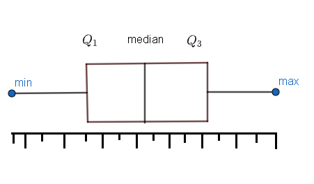
Now, we have to know box plot deeply to move onto its modified version. So, first we have to see how a box plot is drawn. The box plot will have five-number summary of a set of data. We can list these five-number as follows.
(i) The minimum value in the dataset. We have to display this number at the far left end.
(ii) The first quartile (Q1) . This will be placed at the left side in between the minimum value and median. Q1 will be a value below the lower 25% of data contained.
(iii) The median value. We will represent this by a line that will be drawn at the centre of the box.
(iv) The third quartile (Q3) . This quartile will be at the right side in between the median and the maximum value. Q3 will be a value above the lower 25% of data contained.
(v) The maximum value in the dataset which we will be representing at the far right end.
The box plot is shown below.
Now, we have to understand the concept of outliers. Outliers are the values that are far outside the pattern established by the rest of the data. They are very high or very low values in comparison to the rest of the data set. Let us consider the scores of a test \left\\{ 90,98,89,88,46,90,91,84,94 \right\\}
Here we can see that 46 is the outlier because it is a really low value when compared to the rest of the scores.
In a boxplot, we usually marks the maximum and minimum according to the values of the dataset. Let us draw a boxplot of \left\\{ 90,98,89,88,46,91,92,84,94 \right\\} . We have to arrange the data in the increasing order. We will get \left\\{ 46,84,88,89,90,91,92,94,98 \right\\} .
Now, we have to find the range by subtracting minimum value from the maximum value.