Question
Question: The following table gives the distribution of students of two sections according to the marks obtain...
The following table gives the distribution of students of two sections according to the marks obtained by them:
Represent the marks of the students of both the sections on the same graph of two frequency polygons. From the two polygons compare the performance of two sections.
| Marks Section A | FrequencySection A | MarksSection B | FrequencySection B |
|---|---|---|---|
| 0−10 | 3 | 0−10 | 5 |
| 10−20 | 9 | 10−20 | 19 |
| 20−30 | 17 | 20−30 | 15 |
| 30−40 | 12 | 30−40 | 10 |
| 40−50 | 9 | 40−50 | 1 |
Solution
In this question we are asked to represent the frequency polygons on the same graph. In order to proceed with this question we need to know what frequency polygons are. A frequency polygon is the graphical representation. It is similar to histogram. It is used to compare sets of data which are of similar nature. It uses a line graph to represent required quantitative data. Class marks are calculated by dividing the sum of upper and lower limit of class interval by 2.
Complete step by step solution:
We’ll calculate class marks first,
classmarks=2upper limit + lower limit
For example - classmarks(0−10)=20+10=5
| Marks | Class marksSection A | FrequencySection A | Marks | Class marksSection B | FrequencySection B |
|---|---|---|---|---|---|
| 0−10 | 5 | 3 | 0−10 | 5 | 5 |
| 10−20 | 15 | 9 | 10−20 | 15 | 19 |
| 20−30 | 25 | 17 | 20−30 | 25 | 15 |
| 30−40 | 35 | 12 | 30−40 | 35 | 10 |
| 40−50 | 45 | 9 | 40−50 | 45 | 1 |
Now we’ll plot it on line graph,
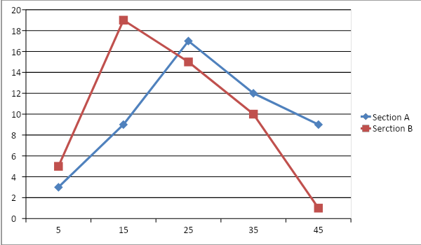
After comparing – When we look at the line graph above, we can observe that Section A is right of Section B which means, more students in Section A have higher marks than students in Section B. It implies performance of Section A is better than B.
Note: The main objective to represent the information in graphical representation is to convert it into a form which can be easily interpreted. And also, plotting information of same type makes it easy to compare both the information. When we are given class intervals it is compulsory to calculate class marks.