Question
Question: The following table gives the distribution of students of two sections according to the marks obtain...
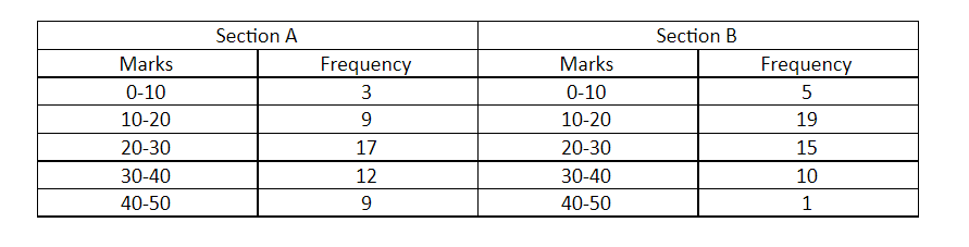
The following table gives the distribution of students of two sections according to the marks obtained by them:
Represent the marks of the students of both the sections on the same graph of two frequency polygons. From the two polygons compare the performance of the two sections.
Solution
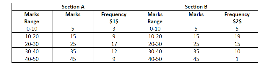
A frequency polygon graph is the visual representation of the distribution among the quantities or the numbers. Simply we can say frequency. Number of times repeated. It indicates the number of occurrences for each of the distinct classes in the data set. Here we will first find the coordinates to plot. Convert the given range of the class in the class marks taking the sum of the upper limit and the lower limit divide by two. And plot the graph using the coordinates.
Complete step by step answer:
Class Marks / Midpoint of the range =2upper limit + lower limit
For the class 1=20+10=5
Similarly find for all the given range of the class and construct the table as shown below.
Now, Plot the point using the Marks and the respective frequency for the section and the section B respectively.
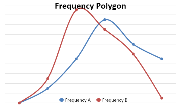
From the above graph we can observe that in section B, the frequency is high when the marks are low and as the marks are increasing the frequency is decreasing whereas, in the section A frequency is increasing as the marks are increasing. So, the performance of section A is better compared to section B.
Note: Also, refer to the other types of the graphs and know the difference between them and the pictorial representation or the diagram which represents the data or the value in the most organized manner.