Question
Question: The following table gives production yield per hectare of wheat of 100 farms of a village. Produ...
The following table gives production yield per hectare of wheat of 100 farms of a village.
| Production yield (in kg/ha) | 50-55 | 55-60 | 60-65 | 65-70 | 70-75 | 75-80 |
|---|---|---|---|---|---|---|
| No. of farms | 2 | 8 | 12 | 24 | 38 | 16 |
Change the distribution to a more than type distribution and draw its ogive.
Solution
Here all we have to do is just convert the given distribution into a more than type distribution. That is given that the total number of farms in the village are 100, and in a more than type distribution we have to start distributing from the total number of farms and then to the next class distribute what is remaining from the first class and so on proceeding the same way to all the classes until the remaining number of farms are equal to number of farms in the last class.
Complete step-by-step solution:
Here after converting the distribution into more than type distribution we have to display the convert data on ogive graphs.
∵The total number of farms are 100.
∴∑fi=100
While converting the distribution into more than distribution the number of farms of the first class start with 100 , as there are 100 farms, and then when going to the next class the number of farms in the first class are subtracted from the 100 farms, and in the third class the number of farms from the second class and placed in it and so on.
Ogive are the graphs that display the number of farms on y-axis and production yield on x-axis, and these ogive graphs are used to estimate how many numbers lie down/below or above a particular value in data. The o-give graph displays the cumulative frequency curves.
Before that converting the distribution into more than distribution:
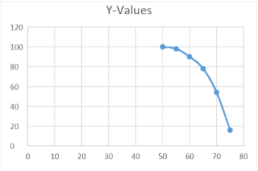
| Production yield (x-axis) | More than 50 | More than 55 | More than 60 | More than 65 | More than 70 | More than 75 |
|---|---|---|---|---|---|---|
| No. of farms (y-axis) | 100 | 100-2=98 | 98-8=90 | 90-12=78 | 78-24=54 | 54-38=16 |
Now displaying the number of farms on y-axis and the production yield on x-axis. The ogive graph:
Note: Here the graph of x-axis can be directly started from 50 to 80 but here it is shown like this, if it’s shown directly from 50 then it would be more elaborate, but the final shape of the graph would remain the same.