Question
Question: The data obtained by measuring the weight of students in a class on a certain day is given in the fo...
The data obtained by measuring the weight of students in a class on a certain day is given in the following distribution.
| Weight (kg) | 60-70 | 70-80 | 80-90 | 90-100 | 100-120 |
|---|---|---|---|---|---|
| Frequency (no. of students) | 3 | 5 | 10 | 9 | 2 |
Draw a histogram to represent this data.
Solution
We here have been given some data and we have to draw its histogram. For this, we will first define what a histogram is. It will be defined as a graphical representation of bars in ranges. Each bar represents how many fall into a particular range. Then we will see what ranges we have been given and we will draw a histogram for it just as we draw a bar graph. Thus, we will get the required histogram.
Complete step by step answer:
We have been given some data and we have to draw its histogram.
To draw a histogram, we first need to know what is meant by it. A histogram is basically like a bar graph but there is a slight difference between them. In a bar graph, a whole bar represents the data of one particular number but in a histogram, a bar represents the data of a range.
Here also, we have been given the ranges of 60-7-, 70-80, 80-90, 90-100 and 100-120 and data regarding it.
We will draw this just like a bar graph only the markings will be according to the ranges.
Drawing it, we will get:
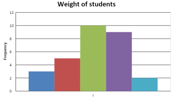
This is our required histogram.
Note:
Always be careful while differentiating between the different types of graphs. Bas graph and histogram also are almost the same but only a slight difference in markings of the graph will change one into the other. Hence, always read the question carefully and draw the right kind of graph.