Question
Question: Name the graph which is used to represent data in a discrete manner? A. Pie B. Histogram C. Ba...
Name the graph which is used to represent data in a discrete manner?
A. Pie
B. Histogram
C. Bar
D. Frequency Polygon
Solution
First we will define each term given in the options, we will start with pie charts and then we will write the definition and given one example , similarly we will define the histogram and frequency polygons and we will draw the similarity between them. Finally, we will explain the bar graph along with an example. We will analyze which shows the data in a discreet manner and then we will get our answer.
Complete step by step answer:
First of all we will see what each term is defined, so let’s consider the first option that is pie charts. Basically, a pie chart is a type of graph that represents the data in the circular graph. It divides the circular graphs into sectors or slices in order to express the numerical problems.
For example: If we are given to prepare a circle graph for the following data that is: a fruit basket is filled with 36% Apples, 29% Bananas, 9% Mangoes, 7% Pineapples and 19% Grapes then it will look like the following figure:
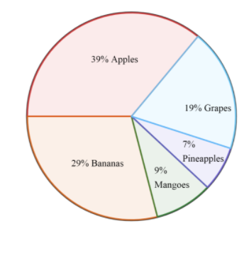
So, we know that it does not show us discrete data rather it shows the comparative data.
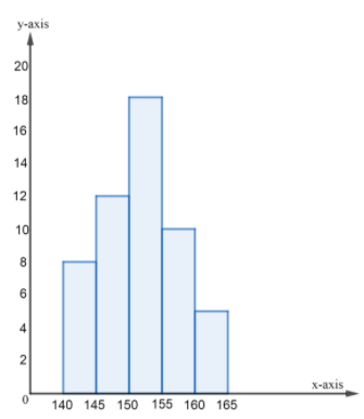
Now, let’s take a look at the meaning of histogram. So, histogram and frequency polygon are more or less identical. Basically a histogram is an area diagram. It can be defined as a set of rectangles with bases along with the intervals between class boundaries and with areas proportional to frequencies in the corresponding classes
For example: We will see the following data which shows the frequency distribution of the heights of 50 students of a class and how it is represented through a histogram.
| Class Interval | 140-145 | 145-150 | 150-155 | 155-160 | 160-165 |
|---|---|---|---|---|---|
| Frequency | 8 | 12 | 18 | 10 | 5 |
So, the histogram will look like the following figure:
Now, frequency polygon represents the same as histogram does. For this, the midpoints of the class intervals known as class marks are used to plot the points. Therefore:
Class Mark=2Upper limit+Lower limit
Therefore, class marks for above data is: 2140+145=142.5 , 2150+145=147.5 , 2155+150=152.5 , 2160+155=157.5 , 2165+160=162.5
Therefore, the frequency polygon will look like the following:
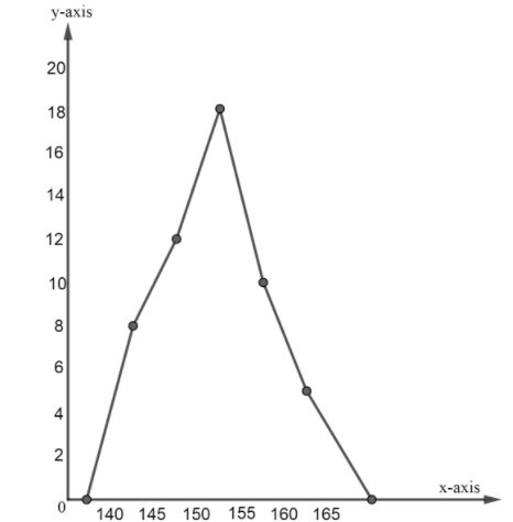
As we saw that both histogram and frequency polygons show grouped data over classes therefore they do not show the data in discrete manner.
Now, we will see the meaning of Bar graphs and how it shows the data. So basically pictorial representation of a grouped data, in the form of vertical or horizontal rectangular bars, where the lengths of the bars are equivalent to the measure of data, are known as bar graphs or bar charts.
For example: We are given that a school conducted a survey to know the favourite sports of the students. And we are given the data in a tabular form as shown below:
| NAME OF THE SPORT | TOTAL NUMBER OF STUDENTS |
|---|---|
| Cricket | 45 |
| Football | 60 |
| Basketball | 99 |
| Volleyball | 66 |
| Chess | 22 |
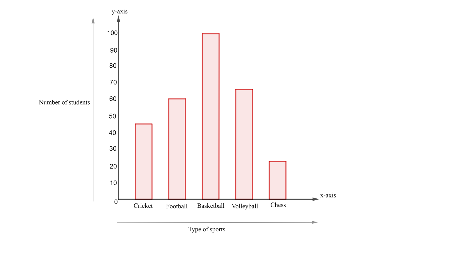
Now, we will draw a graph representing the sports and the total number of students:
As we see that out of all the four options only bar graphs shows us the data in the discrete manner.
Therefore, the correct option is C.
Note:
Students might get confused between Histogram and Bar graphs, remember that in Histogram the data shown is between class intervals whereas in the bar graph the data is categorical. When given these types of questions you must know how the data is shown in each option. If the paper is not descriptive then you can directly go for the answer and mark it provided that you know how the data is represented but if it is a subjective paper always remember that you must explain every term with an example.