Question
Question: How do I graph this table as a clustered bar graph on excel? | Cont-Corn| Hypo-Corn| Iso-Corn| ...
How do I graph this table as a clustered bar graph on excel?
| Cont-Corn| Hypo-Corn| Iso-Corn| Hyper-Corn
---|---|---|---|---
Speed 1| 6.5 cm| 10.9 cm| 8.5 cm| 0.5 cm
Speed 2| 13 cm| 7.8 cm| 13 cm| 1 cm
Speed 3| 14.3 cm| 3 cm| 15 cm| 2 cm
Speed 4| 6.5 cm| 11 cm| 10 cm| 1.5 cm
Speed 5| 10 cm| 10.5 cm| 14 cm| 1.7 cm
Solution
Here in this question we have been asked to draw the clustered bar graph of the given information on excel. For drawing the graph on Excel, we will follow some steps. We will first enter the given data and then choose the range and type of chat that need to be plotted.
Complete step-by-step answer:
Now considering from the question we have been asked to draw the clustered bar graph of the given information on excel.
For drawing the graph on Excel, we will follow some steps.
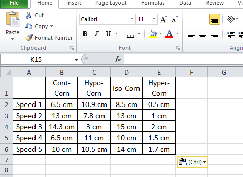
The given information is as below:
| Cont-Corn| Hypo-Corn| Iso-Corn| Hyper-Corn
---|---|---|---|---
Speed 1| 6.5 cm| 10.9 cm| 8.5 cm| 0.5 cm
Speed 2| 13 cm| 7.8 cm| 13 cm| 1 cm
Speed 3| 14.3 cm| 3 cm| 15 cm| 2 cm
Speed 4| 6.5 cm| 11 cm| 10 cm| 1.5 cm
Speed 5| 10 cm| 10.5 cm| 14 cm| 1.7 cm
Step 1: Enter the Data into a new Excel sheet.
In the given question, we need to enter the given information as shown above.
Step 2: Select Range to Create Chart or Graph.
By highlighting the cells that contain the data we want to use in our graph by clicking and dragging our mouse across the cells. Now our cell range will now be highlighted in grey and we can select a chart type.
In this example we need to choose the whole data and select a clustered bar graph type chart which will be the first one when we go to “Insert” and choose “bar”.
Step 4: Add Chart Elements.
We can customize the graph as per our requirements. Like in our case we had chosen different colours and styles and gave a title.
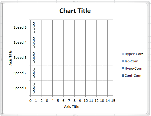
Hence we can conclude that the clustered bar graph of the given information on Excel can be plotted as shown above.
Note: For answering questions of this type we should be sure with the information that we have and carefully plot the graph. We should carefully choose the range of the axis that we need. We should carefully customize our graph accordingly.