Question
Question: Draw a 'more than ogive' for the following data: Class| 0-10| 10-20| 20-30| 30-40| 40-50| 50-...
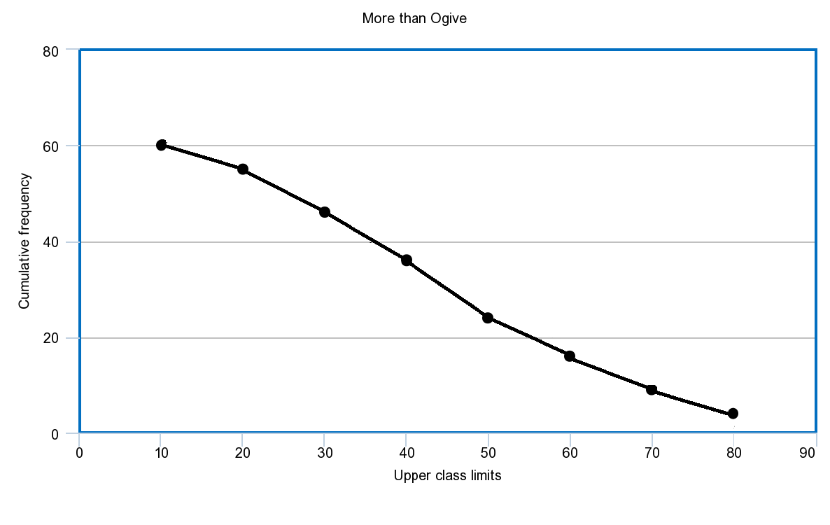
Draw a 'more than ogive' for the following data:
| Class | 0-10 | 10-20 | 20-30 | 30-40 | 40-50 | 50-60 | 60-70 | 70-80 |
|---|---|---|---|---|---|---|---|---|
| Frequency | 5 | 9 | 10 | 12 | 8 | 7 | 5 | 4 |
Solution
To solve the problems like this where it is asked to draw the more than ogive , we should tabulate the given data along with that we should tabulate the midpoint of the intervals and the cumulative frequency for the given data. Then with these data we can plot the curve.
Complete step-by-step answer:
It is given in the question that,
| Class | 0-10 | 10-20 | 20-30 | 30-40 | 40-50 | 50-60 | 60-70 | 70-80 |
|---|---|---|---|---|---|---|---|---|
| Frequency | 5 | 9 | 10 | 12 | 8 | 7 | 5 | 4 |
For plotting 'More than ogive' curve lets tabulate midpoints and the cumulative frequencies of given data,
| Class | midpoint | frequency | Cumulative frequency (more greater than type ) |
|---|---|---|---|
| 0 - 10 | 5 | 5 | 60 |
| 10 - 20 | 15 | 9 | 60-5 = 55 |
| 20 - 30 | 25 | 10 | 60-(5+9) = 46 |
| 30 - 40 | 35 | 12 | 60-(5+9+10) = 36 |
| 40 - 50 | 45 | 8 | 60-(5+9+10+12) = 24 |
| 50 - 60 | 55 | 7 | 60-(5+9+10+12+8) = 16 |
| 60 - 70 | 65 | 5 | 60-(5+9+10+12+8+7) = 9 |
| 70 - 80 | 75 | 4 | 60-(5+9+10+12+8+7+5) = 4 |
Total frequency = 60
With these data we can plot the graph of “More than Ogive” as below,
Note: Students will go wrong in taking cumulative frequency which is greater than type as shown in the table above. if any mistake made in this step will lead to the wrong graph in further steps.